Lab 12 Explaining data with R
We began the semester exploring data with R. In this session, we will not just explore data, we will see how well we can explain it. To do so, we will use some of the new tools and understanding we have developed since then. Our main focus will be on linear regression.
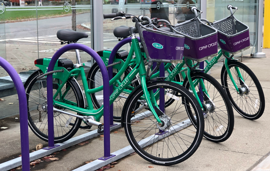
In keeping with the theme of exploration, we will be looking at a dataset about a bike share program started in Washington, DC. These programs are now popular in many cities because they give a convenient way for commuters and tourists to travel short distances without the need for a motor vehicle or fixed-track public transit. The data we will look at were recorded for every day in the year 2011. The data include the number of riders per day who made use of the program. We will try to explain why more people ride on some days and not others. This may not be quite as satisfying as exploring on a real bike, but it comes pretty close.
To help with the exercises in this session, be sure to download the worksheet for this session by right-clicking on the following link and selecting “Save link as…”: Worksheet for Lab 12. Open the saved file (which by default is called “ws_lab12.Rmd”) in RStudio.
12.1 Meet the data
These are the first few rows of our bike sharing data, which are saved in R under the name bike_data.
| date | year | season | month | day | holiday | workday | weather | celsius_actual | celsius_feelslike | humidity | windspeed | num_riders |
|---|---|---|---|---|---|---|---|---|---|---|---|---|
| 2011-01-01 | 2011 | Winter | 1 | Saturday | FALSE | FALSE | Cloudy | 14.110847 | 18.18125 | 80.5833 | 10.749882 | 985 |
| 2011-01-02 | 2011 | Winter | 1 | Sunday | FALSE | FALSE | Cloudy | 14.902598 | 17.68695 | 69.6087 | 16.652113 | 801 |
| 2011-01-03 | 2011 | Winter | 1 | Monday | FALSE | TRUE | Clear | 8.050924 | 9.47025 | 43.7273 | 16.636703 | 1349 |
| 2011-01-04 | 2011 | Winter | 1 | Tuesday | FALSE | TRUE | Clear | 8.200000 | 10.60610 | 59.0435 | 10.739832 | 1562 |
| 2011-01-05 | 2011 | Winter | 1 | Wednesday | FALSE | TRUE | Clear | 9.305237 | 11.46350 | 43.6957 | 12.522300 | 1600 |
| 2011-01-06 | 2011 | Winter | 1 | Thursday | FALSE | TRUE | Clear | 8.378268 | 11.66045 | 51.8261 | 6.000868 | 1606 |
Each row corresponds to a specific day. The response variable we are interested in is called num_riders, the number of people who used the bike share that day. Many of the other variables are self-explanatory, though we will see more of them as we go.
Exercise 12.1 First, let’s make ourselves a histogram to get a sense of how ridership is distributed from day to day. Remember that our dataset is called bike_data and that daily ridership is recorded under the variable num_riders. Try setting the binwidth to 500 to start, but feel free to adjust as you like.
___ %>%
    ggplot(aes(x = ___)) +
___(binwidth = ___)- Describe the shape of the distribution of daily ridership. Is it skewed? Are there any obvious outliers? How many modes does the distribution have?
- Why do think the distribution has the shape that it has? Hint: Consider that the data spans an entire year of time—what sorts of trends happen on a yearly basis?
Exercise 12.2 Let’s dig a little deeper and make a scatterplot of the number of riders per day (dates are recorded under the variable named date). In addition, try using the variable season to color each point.
___ %>%
    ggplot(aes(x = ___, y = ___, color = ___)) +
geom_point()- Describe the trends you see in daily ridership and how those trends relates to the season.
- Use the code block below to make a scatterplot using
celsius_actualinstead ofseasonto color each point. The variablecelsius_actualrecords the daily temperature in degrees Celsius. Which trends in the data seem to be better explained by variation in daily temperature rather than season? (Hint: take a look at the “transitional” seasons, Fall and Spring.)
___ %>%
    ggplot(aes(x = ___, y = ___, color = ___)) +
    geom_point()
12.2 Explaining ridership using season alone
As you recall, with both Analysis of Variance and linear regression, it is possible to calculate \(R^2\), the proportion of variance explained. To spell that out more, \(R^2\) is the proportion of the variability in the response variable that can be “explained” or “accounted for” by an explanatory variable. Some explanatory variables explain a lot, others just a little. The proportion of variance that not explained by an explanatory variable might be explained by some other variable or perhaps by things we haven’t measured. In ANOVA, we defined the proportion of variance explained as:
\[ R^2 = \frac{SSG}{SSG + SSE} \]
where \(SSG\) is the Sum of Squares between Groups and \(SSE\) is the Sum of Squared Errors.
To say that we can “explain” something does not necessarily mean that we know what caused it. For example, the size of your feet “explain” a lot of the variability in the size of your vocabulary. This is not because having large feet causes you to know more words. It is because both foot size and vocabulary size increase with age. Foot size and vocabulary size are correlated but they do not cause one another. Even so, if we knew someone’s foot size, we could probably make a good guess about their vocabulary size. This is what we mean by “explanation” in statistics. In statistics, anything that allows us to make better predictions is an “explanation”. This is different from the everyday definition of “explanation”, which requires that we be able to say why something happened. Understanding why goes beyond pure statistics and into scientific inquiry.
Exercise 12.3 Let’s see how much season could help us explain the daily variation in ridership. To do this, we will use R to conduct an Analysis of Variance using a mathematical model, like we did last time. Our primary interest is not testing a null hypothesis. Instead, we are interested in \(R^2\), the proportion of variance in daily ridership that can be explained by season. Recall from class that we can calculate this from an ANOVA table using the values in the Sum Sq (“sum of squares”) column.
Fill in the blanks in the code below to use R to produce an ANOVA table. We will use season as the explanatory variable and num_riders as the response variable.
lm(___ ~ ___, data = ___) %>%
    anova()
Summarize the results of the ANOVA you just conducted in terms of what it tells us about number of daily riders and season.
What is the proportion of variance in number of daily riders that can be explained by season? Feel free to use the code block below to use R as a calculator (the numbers you need can be copy-pasted from the ANOVA table you just made):
Do you expect that
celsius_actualwill have a lower or higher \(R^2\) thanseason? Explain your reasoning.
12.3 Explaining ridership using temperature
Exercise 12.4 Earlier, we got a hint about the possible relationship between ridership and temperature. Now let’s visualize that relationship directly. Make a scatterplot with celsius_actual on the horizontal axis and num_riders on the vertical axis, including the line of best fit on top.
___ %>%
    ggplot(aes(x = ___, y = ___)) +
    geom_point() +
geom_smooth(method = lm)- Speculate about why the trend in the scatterplot may not be completely linear. Hint: think about what may happen with very high temperatures.
- Use the following chunk of code to help you calculate the Pearson correlation coefficient between
celsius_actualandnum_riders. Based on the result, what is the proportion of variance in daily ridership that can be explained by daily temperature?
___ %>%
    specify(___ ~ ___) %>%
calculate(stat = "correlation")- Compare \(R^2\) based on
seasonwith \(R^2\) based oncelsius_actual. Although temperature explains more variance than season, it does not explain that much more. Why do you think daily temperature variation does not explain even more variance than season? Hint: Think about what changes from season to season besides temperature—how many of those things are relevant to bike riding?
12.4 Inference about a slope using simulation
Although the relationship between daily ridership and temperature may not be completely linear, it is clear that we can still explain a lot of the variability in daily ridership in terms of variability in daily temperature. In this section, we will see how to use simulation to draw inferences about two things: First, whether we might expect the relationship in our data to hold in the population at large (which we check via bootstrapping). Second, whether we can rule out the possibility that there is no relationship in the population at large (which we check via permutation).
12.4.1 Confidence interval for a slope
Exercise 12.5 First, let’s get a sense of what values of the slope in the “population” are plausible by making a confidence interval.
- We’ve used the word “population” a few times now. What is the “population” from which our data were sampled? Hint: imagine that you are the operator of the bike ride share program—what would you want to be able to do based on the data we are analyzing?
- Fill in the blanks in the following chunk of code to use bootstrapping to generate twelve imaginary datasets. The code will then plot each imaginary dataset as if it were real, along with the best-fitting line for each imaginary dataset. How many of your simulated datasets resulted in a positive slope for the best-fitting line?
bike_boot_simulations <- bike_data %>%
    specify(___ ~ ___) %>%
    generate(reps = 12, type = "___")

bike_boot_simulations %>%
    ggplot(aes(x = ___, y = ___)) +
    geom_point() +
    geom_smooth(method = lm) +
facet_wrap("replicate")- Fill in the blanks in the following chunk of code to generate 1000 simulated datasets using bootstrapping, then plot the distribution of slopes across those simulated datasets along with a 95% confidence interval (click on
bike_temp_boot_ciin your R environment to see the limits of your confidence interval). Based on your results, if the daily temperature increases by 1 degree Celsius, what is the 95% confidence interval for the number of additional riders we should expect to see?
bike_temp_boot_dist <- bike_data %>%
    specify(___ ~ ___) %>%
    generate(reps = 1000, type = "___") %>%
    calculate(stat = "slope")

bike_temp_boot_ci <- bike_temp_boot_dist %>%
    get_confidence_interval(level = ___)

bike_temp_boot_dist %>%
    visualize() +
shade_confidence_interval(bike_temp_boot_ci)- One degree Fahrenheit is about 0.56 degrees Celsius. Based on your result in part [c], for each degree Fahrenheit that the temperature increases, what is the 95% confidence interval for the number of additional riders we should expect to see?
12.4.2 Hypothesis test for a slope
Exercise 12.6 Now, let’s use a hypothesis test to address the research question, “is there a relationship between number of daily riders and daily temperature?”
- State the null and alternative hypotheses corresponding to our research question.
- Fill in the blanks in the following chunk of code to use random permutation to generate 12 simulated datasets assuming the null hypothesis is true (Hint: for the
hypothesizeline, think about how we have dealt with other situations in which we were testing whether or not there was a relationship between an explanatory and response variable.). The code will then plot each imaginary dataset as if it were real, along with the best-fitting line for each imaginary dataset. Out of 12 times, how many simulations produced an imaginary dataset where there was a positive slope for the best-fitting line?
bike_null_simulations <- bike_data %>%
    specify(___ ~ ___) %>%
    hypothesize(null = "___") %>%
    generate(reps = 12, type = "___")

bike_null_simulations %>%
    ggplot(aes(x = ___, y = ___)) +
    geom_point() +
    geom_smooth(method = lm) +
facet_wrap("replicate")- Fill in the blanks in the following chunk of code to use random permutation to generate a 1000 simulated datasets assuming the null hypothesis is true, then plot the distribution of slopes across those simulated datasets along with a red line where the actual observed slope is (this will be saved in R under the name
bike_temp_slope). In your own words, explain why the null distribution is centered around zero.
bike_temp_slope <- bike_data %>%
    specify(___ ~ ___) %>%
    calculate(stat = "___")

bike_null_dist <- bike_data %>%
    specify(___ ~ ___) %>%
    hypothesize(null = "___") %>%
    generate(reps = 1000, type = "___") %>%
    calculate(stat = "___")

bike_null_dist %>%
    visualize() +
    shade_p_value(obs_stat = bike_temp_slope, direction = "___")
12.5 Inference about a slope using a mathematical model
Since it is clear that temperature is an important explanatory variable, let’s have a look at another potentially useful variable: wind speed. The average daily wind speed is recorded under the variable windspeed in the bike_data dataset.
Exercise 12.7 Use the chunk of code below to make a scatterplot with windspeed on the horizontal axis and ridership on the vertical axis, along with the best-fitting line on top.
___ %>%
    ggplot(aes(x = ___, y = ___)) +
    geom_point() +
geom_smooth(method = lm)- Does the relationship between windspeed and ridership go in the direction you would expect? Why or why not?
- Fill in the blanks in the code below to use R to apply a mathematical model to the slope. Hint: Notice the similarity to how we did ANOVA in R!
lm(___ ~ ___, data = ___) %>%
    summary()
Based on your results, can you reject the null hypothesis that there is no relationship between number of riders and windspeed? What would you conclude?
- Does variability in windspeed explain as much variance in ridership as temperature or season? Justify your answer.
12.6 What’s up with those weird days?
Exercise 12.8 In all the scatterplots we made above, you may have noticed that there are some days that would normally have large numbers of riders, but actually have very low ridership. It’s a bit hard to see the actual days on the plots, so here are a few of these apparent “outlier” days with very low ridership:
- 2011-04-16
- 2011-08-27
- 2011-10-29
Use your search engine of choice to do a search using each of the dates given above plus the term “Washington DC” (where these data were recorded). What unusual events were happening on or around each of these three days in the DC area that might explain the abnormally low ridership on each of these days?
12.7 Wrap-up
We have explored an interesting dataset with the aim of explaining why bike riding behavior change from day to day. We have illustrated the power of both visualization and inferential statistics for helping us use data to answer interesting questions. We have also discovered outliers and gone beyond our data to understand why they might have occurred. This reinforces the larger point that statistics is rarely the end of the story, but it tells us whether there is a story to be told.